Client
Ravelo // Jonas Brothers
industry
Music
focus
Merch Design // Logo Design // Typography // Illustration
role
Creative Director
Designer
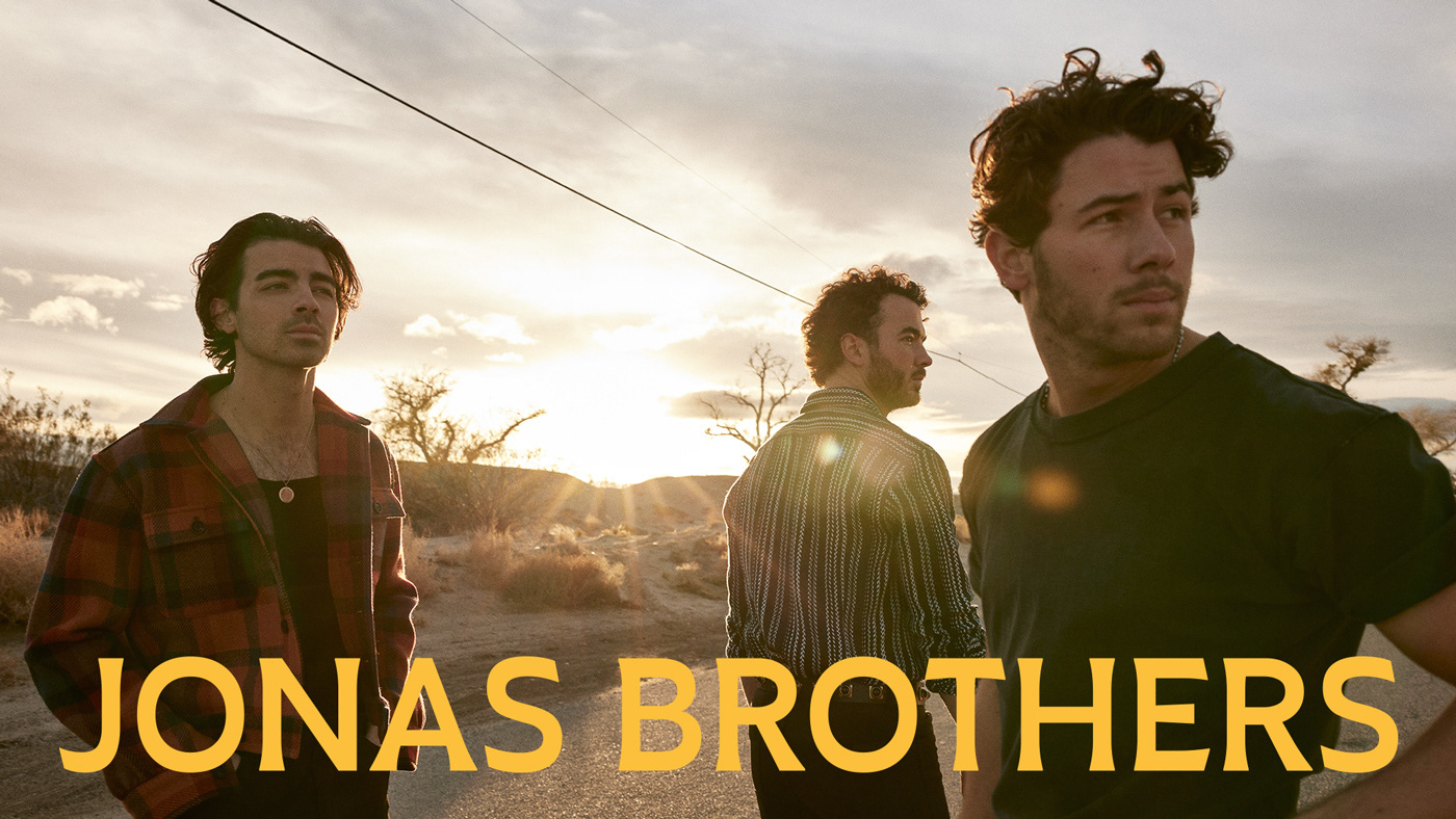
The Jonas Brothers are: Nick, Joe and Kevin Jonas. They were shown to the world in 2005 and took it by storm.
The band has launched a new album with a new, more mature, attitude. We created a small but mighty team to develop an aesthetic that translated their new music. We were inspired by classic American diner aesthetic and 50's and 60's americana.
The scope of work ranged from a new logo to all types of merchandising: from sunglasses, to t-shirts, hoodies, the unavoidable tote bag, unique accessories and even limited edition chocolates.
Client: Ravelo // Jonas Brothers
Agency: Pira Studio
Creative Direction: Seb de la Guardia
Agency: Pira Studio
Creative Direction: Seb de la Guardia
Account Management: Paula Rezende
Design: Seb de la Guardia & Bárbara Caria
Design: Seb de la Guardia & Bárbara Caria

Logo
A mature logo was created, with subtle flared serifs, that echoes the growth of the 3 brothers and their nostalgic, 1970's country aesthetic.


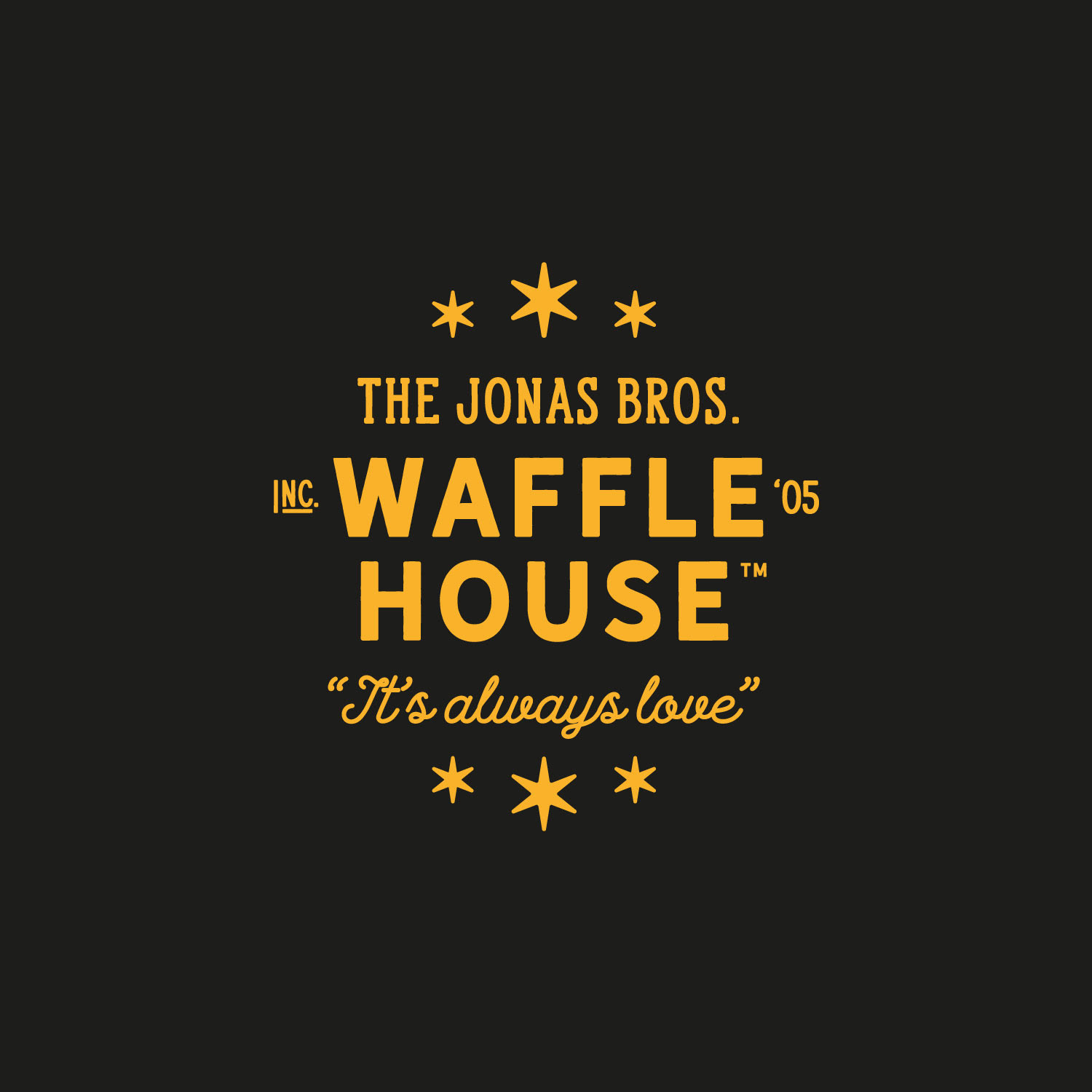
Waffle House Collection
We created various capsule collections. A key one was for The Album's main single: Waffle House. The aesthetic is heavily inspired by 1970's nostalgia, diners, americana and of course, the Waffle House itself.


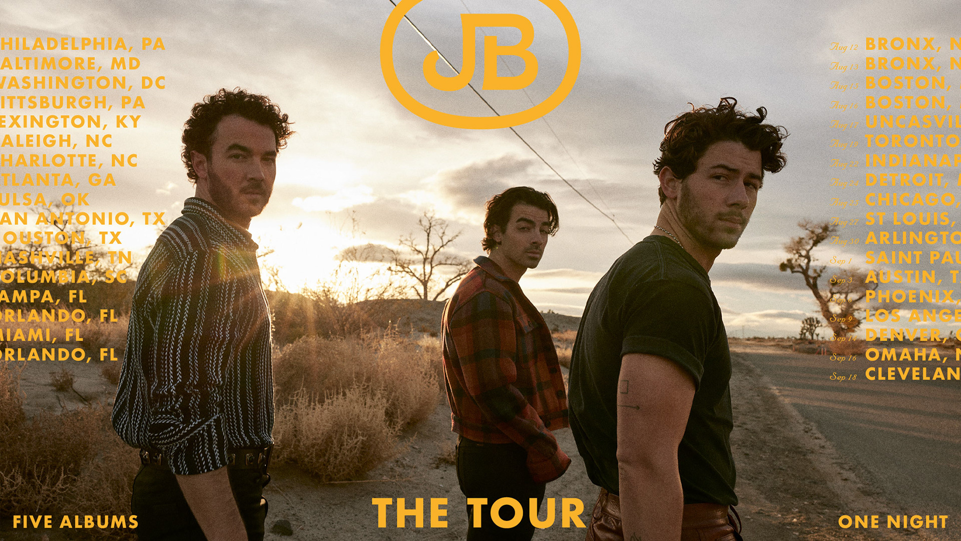
The Tour
We were lucky enough to create the main tour t-shirt for the brother's sold out The Tour, with a classic design and their signature colour.


Jonas Chocolates
A unique brief came in the door: create the packaging for a limited edition collection of chocolates that the Jonas Brothers would be launching. We created a visual identity based on vintage typography and colour blocking. The brothers even launched the Jonas Chocolates while on tour.


Lovebug and Summer Baby Collections
We were tasked with creating many different capsule collections for the Jonas Brother's main singles. One of them for the JB's iconic 2013 single Lovebug. Another one for The Album's second single, Summer Baby.